
Photography, Assemblage & Beyond: A Conversation with Joe Rudko
By ASHLEY GIFFORD
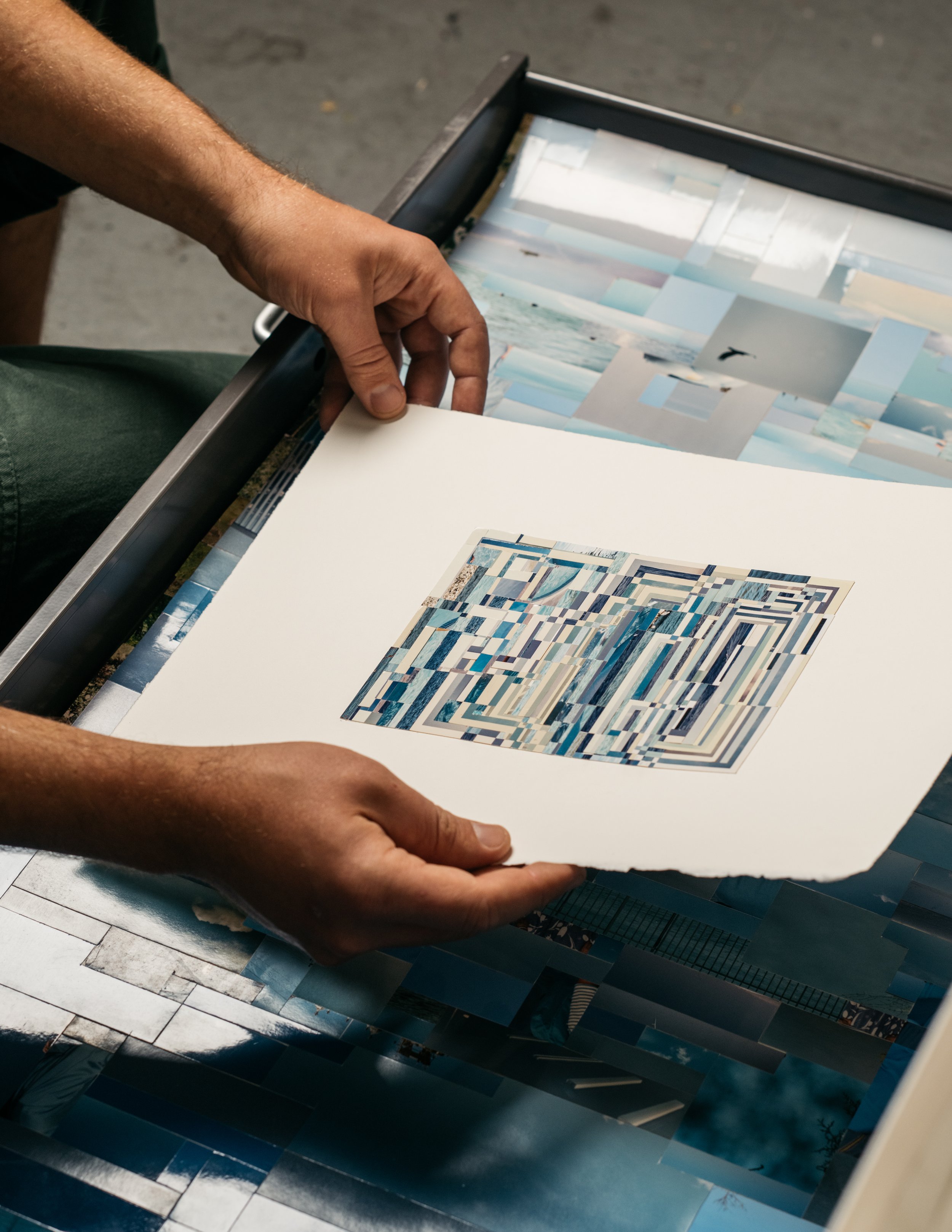
Joe Rudko's chromatic assemblages are equal parts of photography and collage; they are ever-evolving with the artists' thoughts, concepts, and emotions. Previous works like Calendar, 2018, and Timeline, 2019 (Commission for Facebook AIR program) emphasize time, whereas Double Take, 2015, and Rock, 2016 are more sculptural. Rudko consistently explores how expansive photography can be, using it more as a material than a medium. Working with thousands of pictures he has collected over the years, his process is more akin to how a painter uses paint than how a photographer typically uses a camera. However, his works are deeply rooted in photographic studies. Instead, Rudko creates, reimagines, and recontextualizes, carefully splicing images together to create something entirely new. Rudko utilizes similar processes in earlier works by extracting elements from his photographic materials; ripping, cutting, and folding. This manipulation and formation urge viewers to get closer to their spectacular details and appreciate the beauty of the whole.
He captures the collective human experience through seemingly mundane objects that are pertinent snapshots of the human condition and everyday life: portraits, vacations, celebrations, and the environment. They are familiar in that they are seemingly a pooled memory, partly because of how images are sourced, from antique stores to the internet. Pixelated and grid-like inspired patterns in pieces relate to how we currently experience images through screens but are not digital. They are also reminiscent of classical mosaic formations. This conversation delves deeper into recent work, exhibitions and Rudko's unique artistic process.

Joe Rudko in his studio, photo by Kyle Johnson.
Ashley Gifford: What are some of the themes you have been exploring in your most recent bodies of work and exhibitions, Untitled Colors at Von Lintel in Los Angeles, California, and Support System at PDX Contemporary Art in Portland, Oregon?
Joe Rudko: Support System was the first show I made entirely during the pandemic. As a response to the darkness of the times, I tried making work with optimistic imagery - a blue sky, a dancing monument, a spider web made of flowers, a large group portrait. Many of the photographs I work with were probably taken to memorialize something special or essential at the time, and I was thinking about the distance between its origins and its present meaning.
With the Untitled Colors work, I wanted to bring together as many different photographic sources as possible in a simple way. During the last couple of years, I've been thinking more about how we make connections, why specific categories exist, and why we choose to organize information and experiences the way we do.

Support System install, PDX Contemporary Art, Portland. Photos courtesy of the gallery and artist.

Untitled Colors install, Von Lintel Gallery, Los Angeles, California. Photos courtesy of the gallery and artist.
AG: What does a day in your studio typically look like? Could you expand on your studio and artistic process; and your choices when creating?
JR: I ride my bike to the studio in the mid-morning and find a groove until lunch. I usually work on something I've left for myself the night before. If not, I'll listen to new music, and sift through scraps or pictures, and see what sort of patterns or subjects start to emerge. I will draw or sketch. Often the afternoons are reserved for more repetitive and meditative cutting that many of my pieces are built with. My process is constantly shifting and depends mainly on what I am working on. I have a mountain of images that periodically get reorganized, and new juxtapositions can change how I work.
The works in both Support System and Untitled Colors primarily function on an invisible grid structure that echoes digital pixels and mosaics. I typically work intuitively within a set framework, similar to the "yes, and" thinking in improv. I am always seeking a more fluid approach to making, which has led me to trust my first instincts.
I have a background in traditional photography; part of my brain feels like a photographer, but I take my photos from a pile rather than with a camera. But I also think I work similarly to a painter or drawer, using pictures instead of pencil or paint. It's a bit of a mess to sort out, but there's a tension between those different sides of myself.
AG: I understand you have collected thousands of images during your practice; and that they are a combination of personal ones, friends, strangers, and vendors on the internet. I'm curious if you can share an experience relating to how long you've been collecting photographs.
JR: Early on, I collected mainly in thrift stores and antique shops. Several years ago, I stumbled across a miniature black-and-white portrait of an older woman leaning against a car. Something in her eyes rang familiar, and I immediately thought of my Dad's mother, who I had known mainly through a few old photographs. I bought the picture for 50 cents and kept it because the initial encounter had felt meaningful somehow. It was bizarre and exciting to feel something so real from something unknown.
AG: How are the photographs impacted by how were they archived, and film type?
JR: Some of the Black, Gray, and White images go back to the late 1800s, while most color works were taken between 1950-2000 after the Fotomat was popularized. I came across several different branding on the backs of the paper (Kodak, Agfa, Ilford, Efke, Fujifilm, Polaroid), and the print's tone appears warmer or cooler depending on the brand, its age, how it was stored, and whether or not it was exposed to heat and light.
Joe Rudko in his studio, photo by Kyle Johnson.

Joe Rudko in his studio, photo by Kyle Johnson.

Joe Rudko in his studio, photo by Kyle Johnson.
AG: Blue Sky, 2020 and Abstract Sculpture, 2021 focus on specific imagery related to individual entities, the sky and clouds, and figurative sculptures, respectively. In contrast, works like Violet and Orange seem to be inspired by Color Field Painting with their focus on hue, could you discuss your decision-making process in creating these different works and where they intersect with similarities.
JR: I was thinking about Color Field Painting and non-objectivity with Untitled Colors. I wanted to see if I could make something open and abstract with photographs that have a specific history layered into them. It was more interesting to say "this picture could mean anything" than to try and give it a particular meaning.
I consider these works to be different sides of the same idea -- and I have never wanted to be an artist who only makes one kind of thing. I like putting black-and-white photographs near pieces made of color, and I like when abstraction and representation overlap. I think there is something about the specificity of photography that makes me want to open it up into something more expansive.
AG: Black and White, and Magenta, indicate that you seem to be moving toward more geometric abstraction-based work.
JR: These pieces were made alongside some automatic drawings I made on grid paper. Working on these high-contrast, binary compositions was a reprieve from the focus of the solid color works. They are still single colors, but the white borders are intact, giving them a checkerboard-like appearance. Black and White were made entirely out of the edges of studio portraits. I think the limited information in these photograph's margins pushes them closer into the language of abstraction.
AG: When you sent me preliminary images of your work, I ended up saving and using Violet, 2021, as my phone background for a little over a month. I spent significant time with the micro-components of your work - the small individual images that make up the collective piece - where do these unique images contextualize themselves?
JR: I love that. I usually take pictures of my work in progress on my phone; to see it small on the screen is another way of standing far away from it. I like when the work functions as one thing from a distance and another up close.
I think of pieces like Group Portrait as diffusions because they are made with an algorithmic patterning that spreads each photograph apart the same amount. You see a single blurry figure from a distance, but close-up, you know that it's made of tiny bits of different portraits. It's a balance of individual and collective representation. I had feelings about some of the images, sometimes they reminded me of a person I knew or an old friend, but the feelings were neutral with many others. Part of the pleasure of making this work has been finding new meaning in it as I change alongside it.

Group Portrait, in Support System at PDX Contemporary Art, 2020.

AG: After a prolonged experience with Violet, I noticed that I would never consider some of the selections violet or purple. I would like to know more about your choices when creating these cohesive chromatic collages?
JR: When I cut each "violet" piece out of its original photo, it's because it appeared to be violet in that larger context of the image. But things shift when situated next to each other and in a Color Field with hundreds of other violets. It's similar to the visual experiences described in Josef Albers' Interaction of Colors. Color can feel like a fact, but it's also a subjective and relational experience like any other. I try to honor my initial personal, emotional, and potentially flawed interpretations of the color.
There are moments when colors present differently; it makes me aware of how unreal a photo can be. On the other hand, it can remind me to see more in the world around me. For instance, when I go on hikes, I'm amazed at how many colors I can see on a single rock.
AG: Could you talk about a compelling experience you've had with color?
JR: I made Black during the dark Northwest winter last year. Maybe it had something to do with the few hours of daylight, but the first thing I noticed was how reflective the glossy black surface of all the photographs was. It started to act like a mirror and bring in the light from my skylight. It was the darkest piece, but it might have uplifted me the most.
My friend Colleen RJC Bratton did a project a few years ago. She made an oversized colorful quilt big enough for dozens of people to lay on and had a picnic where everyone was invited to wear color therapy glasses. It was a mood-elevating experience. Some color therapy glasses were quite intense, others calming. The color shift affected our perception of the quilt and our experience with each other.
Magenta, 2021.

Black, 2020.
Untitled Colors at Von Lintel in Los Angeles, California is on view until December 18, 2021
Joe Rudko lives and works in Seattle, WA. He received his BFA from Western Washington University and has exhibited in numerous solo and group exhibitions in Seattle, Portland, Denver, Mexico City, Los Angeles, and New York City, including shows at Greg Kucera Gallery (Seattle, WA), the Portland Art Museum, PDX Contemporary Art (Portland, OR), Von Lintel Gallery (Los Angeles, CA), and Davidson Contemporary (New York, NY), among others. He was the recipient of the Future List Award, the Anne Tucker & Clint Willour Young Photographers Endowment, the Facebook AIR Program, and the Vermont Studio Center Fellowship Award. His work is in the collections of The Getty Museum, the Portland Art Museum, the Cleveland Clinic, Fidelity Investments, the City of Seattle, Museum of Fine Arts Houston, and featured on the cover of indie rock band Death Cab for Cutie’s album Kintsugi. Rudko’s work has been featured and reviewed in ARTFORUM, Art in America, HAFNY, City Arts Magazine, Fukt Magazine for Contemporary Drawing, art ltd., Visual Art Source, The Stranger, Lenscratch, and The New York Times.
Ashley Gifford is an art historian and writer. She is also the Founder, Director, and Editor-in-Chief of Art & About. Her writing has been featured in the Portland Mercury, Oregon ArtsWatch, Art Practical, Ceramics Now, and other publications.